Tag Archives: Portfolio

Previous Work: CSR Interface and Dashboard for MetroLINK (2012)

Static demo (w/ dummy data)

Source code (zip)

Before I begin I want to say that the code here, along with any other code I have posted, is posted with the expressed permission of the company that originally had me write it.

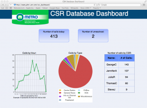
This is something I’ve been anxious to write about, I’m really happy with the results and it helped out quite a bit at MetroLINK.  It’s a web dashboard to show the call data from Metro’s Customer Service Representatives (CSRs).  It pulls data from an Access database through ODBC, and uses PHP to generate the main dashboard as well as the drill-down pages.  The graphs are provided by the excellent Flot javascript library.

Last year it was decided that more information had to be gathered in regards to how many calls the CSRs were taking, and what those calls were about.  Our phone system didn’t support anything beyond basic logging, so until the system could be upgraded something needed to be put in place that would allow the CSRs to track their own calls.  I opted for Access because it was a database system others were already familiar with, and I could make an interface easily enough by using VBA and Access’ own forms.  We saw results almost immediately, and had a much better insight into what the CSRs were doing.

Just using the Access built-in reporting functionality was great, but it was missing the “live” element.  That’s when I decided to start working on this in my spare time.  I discussed what we would need on a dashboard with my co-workers, and then set out to make it happen.

I had some hesitation when I was figuring out how to get the data from the Access file to PHP.  The same file was being used by the CSRs to input this same data, so I had been worried about the file being locked.  The Access forms were already split to avoid this, but I didn’t know how a connection from PHP  would behave.  With ODBC setting up the connection to the Access file was a breeze, and I was pleased to find out it handled multiple connections without issue.  On top of that I could specify that the connection was read-only, providing some security as well.

When I was designing the dashboard I wanted it to have a similar appearance to the public-facing website gogreenmetro.com, so I borrowed the color scheme and title image.  While the data was only changing on each refresh (more on that later) I wanted the dashboard to appear to have activity in it.  To get to this goal I included several hover-over effects and made things respond in useful ways where I could.  Primarily in the graphs and tables where you can highlight parts and get specific information about a point or pie piece.  While it isn’t perfect, it gives the dashboard a little more polish and makes it feel more “alive” than the same page without those elements.

After the main dashboard was completed I started working on the drill-down pages.  They can both be accessed by clicking the numbers for total number of calls and number of unresolved on the main page.  The unresolved drill-down is just a larger version of the breakdown by CSR, which is just building a table.  But the number of calls drill-down introduced some challenges.

On the main page I used the hour function to group calls by hour, and sent that to Flot.  It was simple, and worked for the purposes of the graph.  Moving on to the more advanced graphs though, that method was no longer going to work.  I had to use Flot’s time support, which means I needed to get milliseconds from the Unix Epoch, as that’s JavaScript’s native time format.  None of this was too challenging until timezones entered the picture.  Using Datediff to give me seconds from epoch gave me a sort of “false UTC” that treats the times as if there was no time zone offset.  Since the data would always be correct in the actual database and the presentation wasn’t affected, I saw no problems with this.  It actually encourages it in the Flot API instructions.

Until I checked the tooltips.  JavaScript corrects for time zone when you start using date functions, so all my times were coming in a few hours off.  PHP provides a great way to get the local time zone offset in seconds, so I used that to correct the difference by changing it before the page was rendered.  A side effect of this is that the times change depending on where the page is viewed, so 3pm Central would be 1pm Pacific and so on.  In this context it would probably be a bug, but in other contexts it would be a feature.

In all, this project taught me a lot.  It reinforced my knowledge of things like JSON, HTML/CSS, and how to implement designs to work cross-browser.  It gave me a chance to use PHP for a project, and I learned about it in the process.  Finally, it also gave me a chance to really use Flot and jQuery.  Being able to bring all these things together in one consistent project was a great experience.
Previous Work: Transfer Chart at MetroLINK (2009)

This is my first post in a series detailing some of my previous work.  It serves to remind me of how I accomplished tasks before, formats and techniques I used, and gives me a means to show my work to others if needed.

When I started at Metrolink I was tasked with finding ways to improve their Computer Aided Dispatch / Automatic Vehicle Location (CAD/AVL) system and implement the data it was using.  Part of that process was filling in for dispatchers and learning the routes and stops used by the buses.

The most difficult part of this was sending passenger requested transfers.  They had to be sent from the requesting buses to the receiving buses manually, through the dispatcher.  For a seasoned dispatcher this wasn’t a problem, but in my case I never had enough time on dispatch to really cement in my mind which buses would be at each transfer location.  Eventually I found a way to make a cheat sheet:  I would use SQL to query the scheduling database, giving me an always up-to-date schedule from the current time to about an hour after that.  I would use JSP and Spring to get that information onto a web page and formatted in a way that makes determining where the transfers are going easier.  Then I could access this sheet from any browser to figure out the transfers more quickly, and give it to new dispatches to aid them as well.

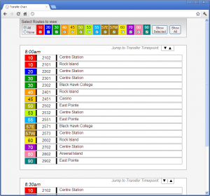
Here is what it looks like, or click here for an offline demo:Metrolink's Transfer Chart

I don’t want to write pages of material about how Metro’s route system works, but suffice it to say that the Route (the colored section) is a path the bus takes, the block number next to it designates different buses on the same route, and the location shown on the right tells you where the bus will be at the time shown on top of the box.  Up top you can filter out just the routes you want to see.

A really basic example of how this would be used is this:  Assume it’s about 7:50am, and I have the screen shown above. I receive a transfer from block number 2102 requesting the Route 30.  Looking over the 8:00am entry, I can see that the 2102 is a route 10 bus that will be at Centre Station at that time.  So now I need to look at the route 30s – there is one that will be at Black Hawk College at 8:00, and another that will be at Centre Station.  The Centre Station bus is the one I want, so I’ll send the message to the bus with the block number 2302.  The whole process takes just a few seconds, which is important because there are a large number of transfers that come in.

When I was designing this I had several objectives in mind, along with making sure the chart functioned correctly.  First I wanted to keep content and presentation as separate as possible.  It makes for cleaner code – especially since this is written in JSP for actual use – and I love the idea of swapping out the CSS and some images for a complete appearance overhaul.  The only portion of this page where I break that ideal is the table up top – the background colors are set on the page.  That said, there isn’t much of a reason to change that table, and doing this via CSS is easy enough by setting an ID for each cell.

I wanted the design to be consistent cross-browser as well.  Unfortunately when dealing with IE6 there is only so much one can hope for, but generally speaking this looks the same no matter how you load it.  And it doesn’t lose functionality in any browser.  That said, since I wrote the code some display inconsistencies have popped up in the newest version of Firefox.  Specifically in how the table is handled in the top menu bar.

This project had its share of problems too, I hadn’t worked with visibility and display CSS settings before, so learning how they worked took some time and made for some unusual results.  This was exacerbated a bit when I added the ability to jump between “time points” where the buses are at one of the transfer locations.  I had to put an anchor link in an invisible div that remained active in the DOM, while not disturbing the rest of the layout, and also jumped to exactly the right position when click.  It took some time tweaking to get all of that working, but I love the results.  When you jump to an item it lines up with the top nearly perfectly.

Also, if I had to do it over I wouldn’t use Spring for this chart.  I had done some internship work at Pearson where I used Spring and JSP to display database information, and having heard about how much easier Spring makes database access I figured it would be foolish not to include it.  But this project only needed one query to be sent on load time, and all the excess that Spring brought to the table wasn’t worth it.  If I had more queries to run it would be a whole different story, but for something this simple I think Spring was excessive.

Overall, I’ve been very happy with how this project turned out and how useful it’s been.  The first day I used it I was nearly able to keep pace with the other dispatchers, and the drivers noticed that I wasn’t taking as long to get them their information.  It was even used for dispatchers in training up until about a month or two ago, when the CAD/AVL system automated the sending of transfers.  Not bad eh?