Monthly Archives: May 2012

Previous Work: Halo Stats (2010-2011)


Download the Halo Stats for TouchPad source code

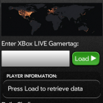
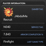
When Halo Reach was released a few years ago, I stumbled upon their statistics API and saw an opportunity for a new webOS application.  I had seen some success with my Quick Subnets app and wanted to develop more, but a creative writer’s block had set in and I couldn’t find something I wanted to build.  When I saw the API that was available, inspiration finally hit!  I created an application that allowed the user to look up any Halo Reach player and see their information.

Now, I’ll be the first person to downplay the abilities of Halo Stats.  It basically only loads player and challenge data, when other applications load all kinds of per-match statistics and information, and even display it in a better format.  But at the time, deciding to write it was a lofty goal.  I had never written an application that connects to the internet before other than some class projects in college, and I didn’t really know about AJAX and JSON beyond just the concepts of them.  Writing this was an opportunity to learn both of those concepts, and through that further expand my Javascript knowledge.

One thing I remember in particular is finding out how easy it is to access JSON compared to XML or other formats.  To do this day I opt for JSON when I can because of that.  I also remember that the frameworks used on the webOS hardware would block XMLHttpRequest calls, and wanted their abstracted versions to be used instead.  That was an adventure in troubleshooting almost worth its own post!

After I had written Halo Stats for the Palm Pre, I was actually contacted by a programmer representative at Palm who wanted to get me set up to write more apps, and even encouraged me to get a TouchPad version of the application together before it launched.  The TouchPad was using a new framework called Enyo, while the Pre had used Prototype.  So at the time I was writing code for a framework with no documentation outside the HP/Palm forums, for hardware that hadn’t been released to the public yet.  All my testing was done via web browser or emulator.  It was quite the challenge, and experience!

There are things I would definitely do different if I were to write this again though.  For me the biggest problem is in the code itself, I had some problems associating the style information to the elements that Enyo was generating; so I chose instead to set the innerHTML property of the elements to some HTML I was generating, and then I would control the styling via CSS.  This was beneficial in many ways,  I could centralize my styling, it allowed me to use techniques I was already familiar with and made the development process faster.  But it was detrimental in that I had no control of the display or positioning that was happening higher up in the software, and couldn’t predict some of the output because of that.  And the resulting code now has chunks of hard coded HTML in it, which is ultimately harder to work with in the long term.  When I made MD5 Lookup I worked around that, but I had far lower styling expectations for that program.

Staying on the styling issues – looking back I really wish I had put more time into it.  I will always claim to be a web developer before a designer, but I’m not completely blind to a bad layout.  The commendations are off-center and not vertically aligned with each other, there is a blue border around the right frame for no real reason, the challenges don’t like up with the map and other elements – and I could go on.  Ultimately the design was rushed and it makes the entire application worse.  In the future that is something I be sure to avoid, by putting in the time to properly test the styling and nitpick over the small details until it looks more refined.  Again, I’m not a designer – but that doesn’t excuse a poor layout and appearance. In retrospect I’d rather have a simple design that looks great than what happened here.

At this point the TouchPad, Pre, and webOS are outmoded, and even Bungie’s stat servers only give back historical data.  No new games are being registered on their servers.; everything has been replaced with 343’s Halo Waypoint.  But, if you have some webOS hardware or an emulator image Halo Stats is still available in the app store, and you can even look up a player’s info, as long as they played before the switch over to 343. I’ve posted the source code above as well – most of my writing is in the source folder, under SplitView.js and Splitview.css.

Thanks for reading!

Previous Work: Transfer Chart at MetroLINK (2009)

This is my first post in a series detailing some of my previous work.  It serves to remind me of how I accomplished tasks before, formats and techniques I used, and gives me a means to show my work to others if needed.

When I started at Metrolink I was tasked with finding ways to improve their Computer Aided Dispatch / Automatic Vehicle Location (CAD/AVL) system and implement the data it was using.  Part of that process was filling in for dispatchers and learning the routes and stops used by the buses.

The most difficult part of this was sending passenger requested transfers.  They had to be sent from the requesting buses to the receiving buses manually, through the dispatcher.  For a seasoned dispatcher this wasn’t a problem, but in my case I never had enough time on dispatch to really cement in my mind which buses would be at each transfer location.  Eventually I found a way to make a cheat sheet:  I would use SQL to query the scheduling database, giving me an always up-to-date schedule from the current time to about an hour after that.  I would use JSP and Spring to get that information onto a web page and formatted in a way that makes determining where the transfers are going easier.  Then I could access this sheet from any browser to figure out the transfers more quickly, and give it to new dispatches to aid them as well.

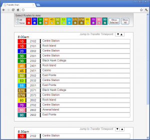
Here is what it looks like, or click here for an offline demo:Metrolink's Transfer Chart

I don’t want to write pages of material about how Metro’s route system works, but suffice it to say that the Route (the colored section) is a path the bus takes, the block number next to it designates different buses on the same route, and the location shown on the right tells you where the bus will be at the time shown on top of the box.  Up top you can filter out just the routes you want to see.

A really basic example of how this would be used is this:  Assume it’s about 7:50am, and I have the screen shown above. I receive a transfer from block number 2102 requesting the Route 30.  Looking over the 8:00am entry, I can see that the 2102 is a route 10 bus that will be at Centre Station at that time.  So now I need to look at the route 30s – there is one that will be at Black Hawk College at 8:00, and another that will be at Centre Station.  The Centre Station bus is the one I want, so I’ll send the message to the bus with the block number 2302.  The whole process takes just a few seconds, which is important because there are a large number of transfers that come in.

When I was designing this I had several objectives in mind, along with making sure the chart functioned correctly.  First I wanted to keep content and presentation as separate as possible.  It makes for cleaner code – especially since this is written in JSP for actual use – and I love the idea of swapping out the CSS and some images for a complete appearance overhaul.  The only portion of this page where I break that ideal is the table up top – the background colors are set on the page.  That said, there isn’t much of a reason to change that table, and doing this via CSS is easy enough by setting an ID for each cell.

I wanted the design to be consistent cross-browser as well.  Unfortunately when dealing with IE6 there is only so much one can hope for, but generally speaking this looks the same no matter how you load it.  And it doesn’t lose functionality in any browser.  That said, since I wrote the code some display inconsistencies have popped up in the newest version of Firefox.  Specifically in how the table is handled in the top menu bar.

This project had its share of problems too, I hadn’t worked with visibility and display CSS settings before, so learning how they worked took some time and made for some unusual results.  This was exacerbated a bit when I added the ability to jump between “time points” where the buses are at one of the transfer locations.  I had to put an anchor link in an invisible div that remained active in the DOM, while not disturbing the rest of the layout, and also jumped to exactly the right position when click.  It took some time tweaking to get all of that working, but I love the results.  When you jump to an item it lines up with the top nearly perfectly.

Also, if I had to do it over I wouldn’t use Spring for this chart.  I had done some internship work at Pearson where I used Spring and JSP to display database information, and having heard about how much easier Spring makes database access I figured it would be foolish not to include it.  But this project only needed one query to be sent on load time, and all the excess that Spring brought to the table wasn’t worth it.  If I had more queries to run it would be a whole different story, but for something this simple I think Spring was excessive.

Overall, I’ve been very happy with how this project turned out and how useful it’s been.  The first day I used it I was nearly able to keep pace with the other dispatchers, and the drivers noticed that I wasn’t taking as long to get them their information.  It was even used for dispatchers in training up until about a month or two ago, when the CAD/AVL system automated the sending of transfers.  Not bad eh?